
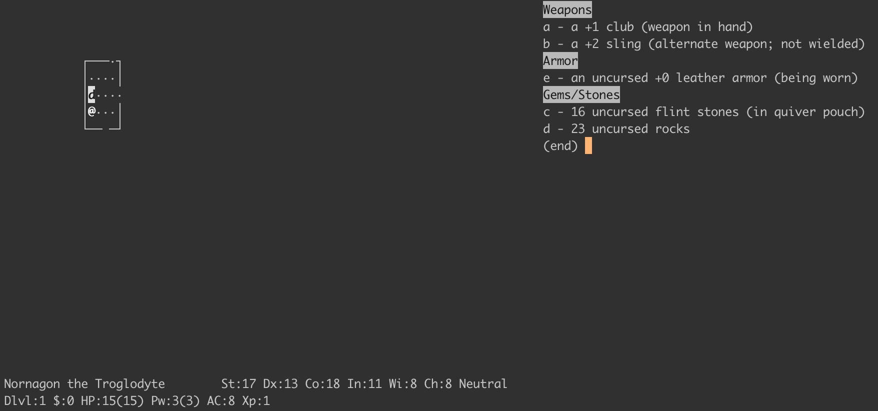
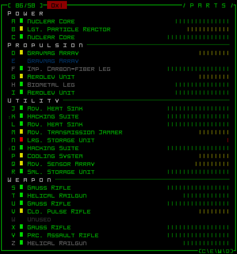
Roguelikes tend to have a lot of UI. And, frequently, it's fiddly UI—there are lots of things to display, with deep and complex information. So UI layout is a pretty important part of building a roguelike.
There are lots of different ways to write code that produces UI. If you were going to start from first principles, which I did for Adrift, you might start out writing code that computes the location of each character directly, something like this:
left = 10
top = 10
drawCharacter(left, top, "|")
drawString(left + 1, top, "Inventory")
top += 1
for (item in items) {
  drawCharacter(left, top, "|")
  drawString(left + 1, top, item.name)
  top += 1
}
Keeping track of the precise location where each character should be placed quickly becomes cumbersome. It's really easy to mess up the calculations for what should go where, and it's hard to reorganize UI that's written like this. Not to say this style of UI code can't be perfectly serviceable—most of NetHack's UI code is written this way, for example, and Cataclysm: Dark Days Ahead too! And you can achieve some nice idiosyncratic effects with it.
But: it seems like a lot of effort. I'm time-poor, and I want the computer to help me with this. Enter UI layout algorithms. Instead of describing the specific location of each character on the screen, I'd rather describe at a high level the relationships that different parts of the UI have with each other, and then let the computer figure out where precisely to draw everything. For instance, I might express the above snippet like this:
widget = BorderLeft(
  Column(
    Text('Inventory'),
    items.map(item =>
      Text(item.name)
    )
  )
)
draw(widget, 10, 10)
I still specify the location on the screen of the top-left corner, but everything else is the computer's problem.
How might we make a system that works like this? What kind of properties would we want this kind of system to have?
As previously covered, I'm time-poor, so instead of coming up with this system from scratch myself, I decided to copy someone else's. The first thought I had was to look at tools like Ink, which bring something close to CSS's flexbox to the terminal. Ink is based on Yoga under the hood, which reimplements the CSS flexbox algorithm in a cross-platform way. However: it's really complicated. The layout code is nearly 5,000 lines of C++, not to mention bindings, and to use it I'd have to bring in another native library. On top of that, Yoga isn't built with discrete grids like the console in mind: all its coordinates are floating-point numbers. It seemed like there was a simpler way.
But this got me thinking: what layout algorithms are out there? I've already mentioned flexbox, and CSS also defines a grid layout algorithm, among other layout algorithms. But there's also Auto Layout, which is a constraint-based system that uses linear programming under the hood, and Flutter, which uses a single-pass algorithm, and SwiftUI which is similar, and GTK which has a whole bunch of different layout algorithms (including a constraint-based one like Auto Layout), and so does Qt. What a dizzying array of options! Which ones of these are good? Which are appropriate for building UI in roguelikes?
I don't know, but I was drawn to the simplicity of the SwiftUI/Flutter model. It seemed flexible and powerful while still being simple and fast. The two models are similar but Flutter is much better-documented, so that's the one I went with, and which I'll describe here.
Flutter calls its fundamental units of layout RenderObjects. There's some other stuff around this but RenderObjects are what do the actual layout, so I'll ignore the other stuff. The layout algorithm is as follows. Descending through the tree in a depth-first manner, each RenderObject:
- receives a minimum and maximum size from its parent,
- lays out its children, passing down size constraint information, and then
- picks a size for itself within the bounds given to it.
Each RenderObject picks its own size (within the bounds given), but offsets are chosen by the parent. There's a more in-depth (but still really readable) explanation in the Flutter documentation.
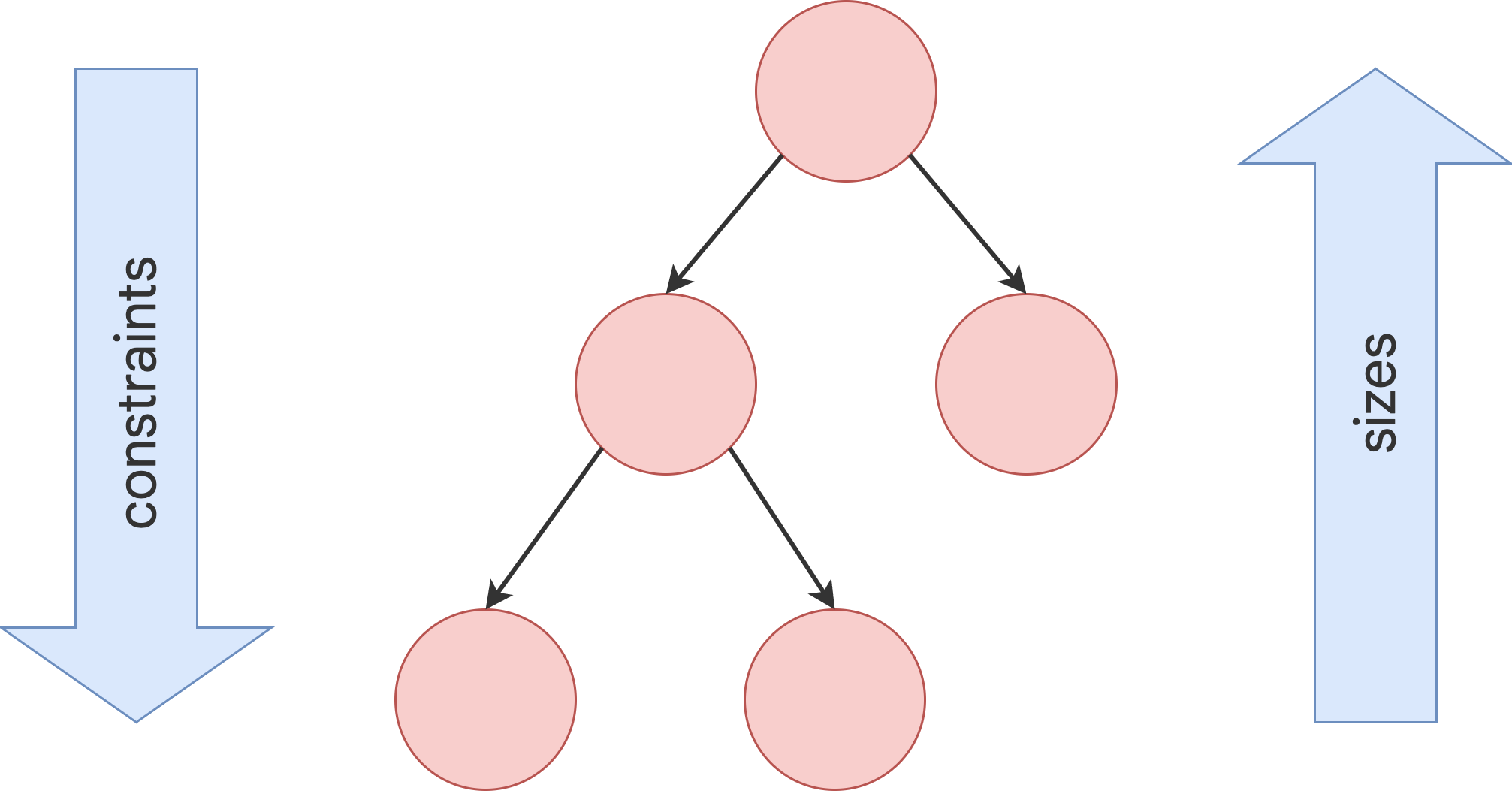
This is a single-pass layout algorithm. Once the algorithm is complete, every RenderObject has a size and offset, and a second pass is done to paint the UI onto the screen.
This turned out to be really easy to implement! This is the structure, roughly speaking:
interface Constraints {
  int minWidth();
  int maxWidth();
  int minHeight();
  int maxHeight();
}

interface RenderObject {
  void layout(Constraints constraints);
  void paint(PaintContext context, Offset offset);
  Size size();
}
Now, this RenderBox interface doesn't by itself do any kind of layout—it's not even a tree!—it just provides the structure for the algorithm. This is where the power of this approach comes in: you can write any layout logic you want as long as it follows this structure! You could even have a nested RenderObject that lays its own children out using a completely different algorithm, as long as the total final size obeys the constraints that were passed to it.
As an example, a BorderLeft RenderObject might look like this:
class BorderLeft implements RenderObject {
  private RenderObject child;
  BorderLeft(RenderObject child) { this.child = child; }

  void layout(Constraints constraints) {
    // Since we're going to be 1 character wider than our child,
    // ask it to make itself be 1 narrower than we were asked to be.
    Constraints childConstraints = new Constraints(
      /* minWidth = */ constraints.minWidth - 1,
      /* maxWidth = */ constraints.maxWidth - 1,
      /* minHeight = */ constraints.minHeight,
      /* maxHeight = */ constraints.maxHeight,
    );
    child.layout(childConstraints);
  }

  Size size() {
    // We are always 1 wider than our child.
    return child.size().add(new Size(1, 0));
  }

  void paint(PaintContext context, Offset offset) {
    context.paintBorder(offset.x(), offset.y(), size().height());
    child.paint(context, offset.add(new Offset(1, 0));
  }
}
This is composable with any other RenderObject, and will add a border to the left of it.
There are lots of kinds of useful, generic, reusable RenderObjects. For instance, an object that renders text can handle text wrapping based on the maxWidth that is given to it. A column object can lay out its children vertically on top of each other (or, for a more general tool, see for example the Flex widget in Flutter, that implements a simplified version of something like CSS flexbox).
I built this system into Adrift and I've converted all the UI code over to it. I've been liking it a lot! Maybe you would like it too? Give it a try and let me know how it goes!