
UIs that display content in chronological order in a vertical list seem to be undecided on whether ‘now’ is at the top or the bottom.

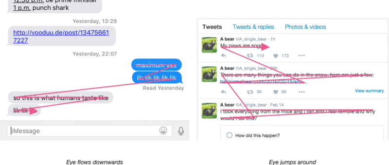
I wonder what the decision to go one way or the other involved? One hypothesis I have is that putting ‘now’ at the top is better when the most important content is the most recent (as is the case for e.g. nytimes.com). But for content which you want to read in chronological order, it seems that now-at-the-top is worse, because your eyes jump around a lot more when reading.
The ‘important stuff goes at the top’ strategy emerges from the fact that we’re used to scrolling downwards on a web page. It’s perfectly possible to have a recency-focused site that’s also in chronological order—but you have to invert the usual direction of scrolling, and have the page be scrolled to the bottom when it loads, rather than to the top as it is by default. You’d have to scroll up to see more content, instead of down. It’d be interesting to build a prototype Twitter client based on that concept (and fitting for my Australian heritage).